When I first saw the new Facebook profile design, the first thought was “Why are they killing us with all the pictures?!” I do not just mean the row of the latest photos you have been tagged in, but photos everywhere. Now there is a long list of photos of friends that stretch far down the left side of the page.
It goes way beyond photos, too. Now all of that stuff you wanted near the top of the page where people are more likely to see it, such as websites, and the little box with your brief message … They are gone! Mine had a nice compilation of my blog addresses and Facebook pages, and my message said “Driving fast is not dangerous … it is the slowing down that can kill you. Drive like death is chasing you and it will all be fine!” Now that stuff is buried under the “Info” link somewhere.
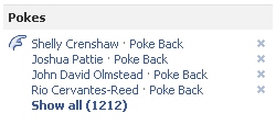
Now I have “Pokes” right there at the top of the right side of the page, just where I needed it. Pokes … seriously? Why in the world would I need pokes near the top of the page? Don’t poke me. This is not MySpace (yet), and I am not sending you a unicorn for your Farmville, either! Fortunately, I found that if you click the “x” beside each of the pokes, it will go away. I never noticed how many people had poked me! Now I feel like a pincushion.
I am listing a few areas where it was even more frustrating than a “poke”.
Employer
Something that bothered me even more about my new Facebook profile was the “Employer” part. Fine, maybe that will be more conducive to business networking, but … there is a big but!
If your employer has a Facebook page, and many do, it will try to link to that. However, what I found is that it may order things differently than expected. For example, I wrote three books in 2009. Now, all of the sudden, one of my books came up as the employer listed on the front page of my profile. That was because it was the newest thing in my employment history. Plus, when I went to the “Info” link where all of my work is laid out, it listed each of my employers’ Facebook pages, but the photos were the generic Facebook page placeholder, and it linked to generic pages, and not my established Facebook pages. My solution was to delete and re-add each of them, paying attention to dates, so it would reflect the one I want to show on my profile. Since I have multiple companies, that was just another hassle to deal with.
Employers are also listed first when clicking on the “Info” link on profiles. It seems that Facebook is trying to increase the prominence of “Employers” and make it a hybrid of LinkedIn and Google Profiles. In fact, it is quite interesting how similar it looks in comparison with a Google profile.
Basic Information
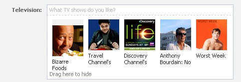
If you want to see somebody’s “Basic Information”, or for people to see yours, be ready to scroll a while. You will find it down below their Employers, Education, Philosophy, Favorite Quotes, Sports, Arts and Entertainment, Books, Movies, Television, and Activities and Interests.
I really didn’t need Johnny Cash showing up above my “Basic Information”, did I? It is basic, so shouldn’t we lead with basic info and save some of our more specific information for scrolling?
At first, it seemed that you could clean this up by editing your profile and dragging your “likes” to hide them, but it is not intuitive. There is a tiny little statement “Drag here to hide”, but it does not even appear until you start to drag the image. What I found later was that it showed up anyway, unless you go to each page and “dislike” them.

Tagged Photos
Since Facebook is now displaying a row of the most recent photos you were tagged in right at the top of your profile, it leaves a couple of choices. You can either elect to no longer allow tagging of photos of you, or you can be sure to go tag yourself in something more flattering. There is a little “x” in the corner of each image, but if you are like me, you want to choose the images displayed on your profile. I took a couple minutes to go tag myself and it cleared it up, for now, but only until somebody catches me with a stupid look on my face again.
New Facebook Summary
Clearly, Facebook has a right to do whatever they feel is good for their company. In this case, it probably prompted millions of users to make updates to their information. That was clever on Facebook’s part. It also gave them more room to place advertisements. The bad side of that is all the distraction from the squillion other images scattered around the page.
What do you think?